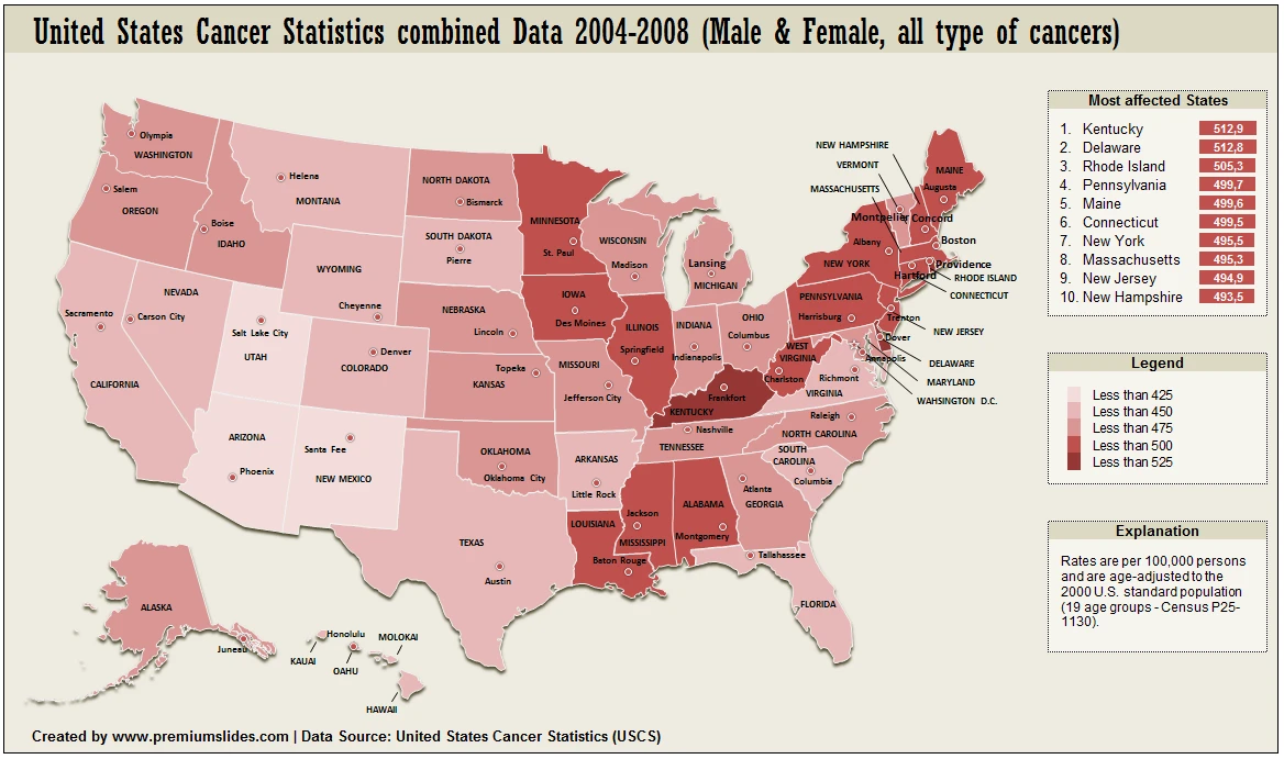
This a PremiumSlides data map of United States. It shows the cancer rate in different States. As you can see the States in the east of US are more affected. The information is a data combination of the years 2004-2008. Rates are per 100,000 persons and are aged-adjusted to 2000 U.S. standard population. You can find more information about this topic on United States Cancer Statistics (USCS) as well.
