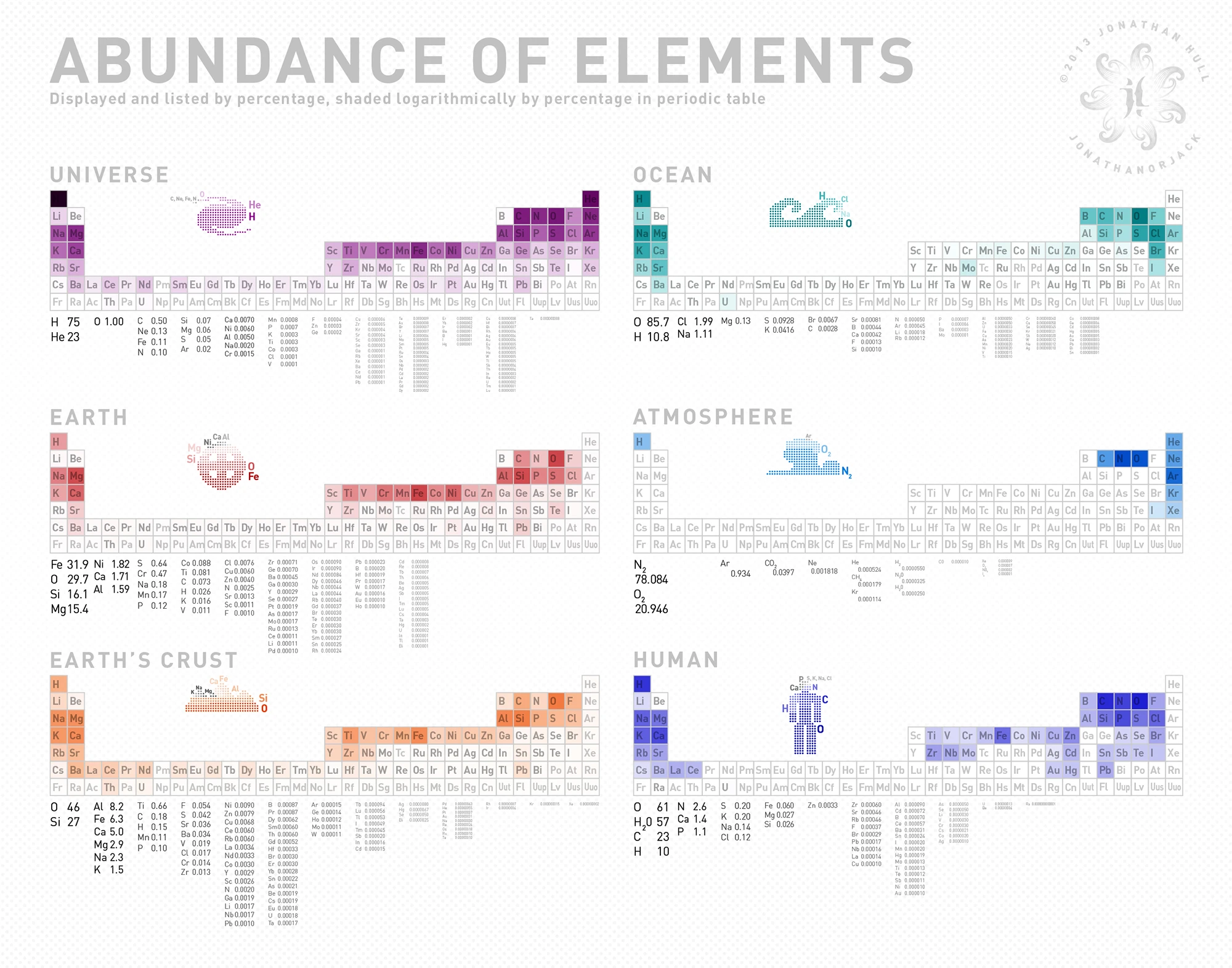
Playing around with some simple, less embellished infographics before prioritizing more illustrative projects. This is just a basic display of the abundance of elements in the known universe, the Earth, the EarthÂ’s crust, the ocean, the atmosphere, and the human body. The graphic includes a more or less basic percentage breakdown image, as well as the occurrence on the periodic table (shaded logarithmically so as not to miss out on the elements with smaller proportions). The atmosphere breaks down mostly into compounds and the human chart also includes the average incidence of water, iron occurrence there is also a noted average as there is a particular difference between men and women.
