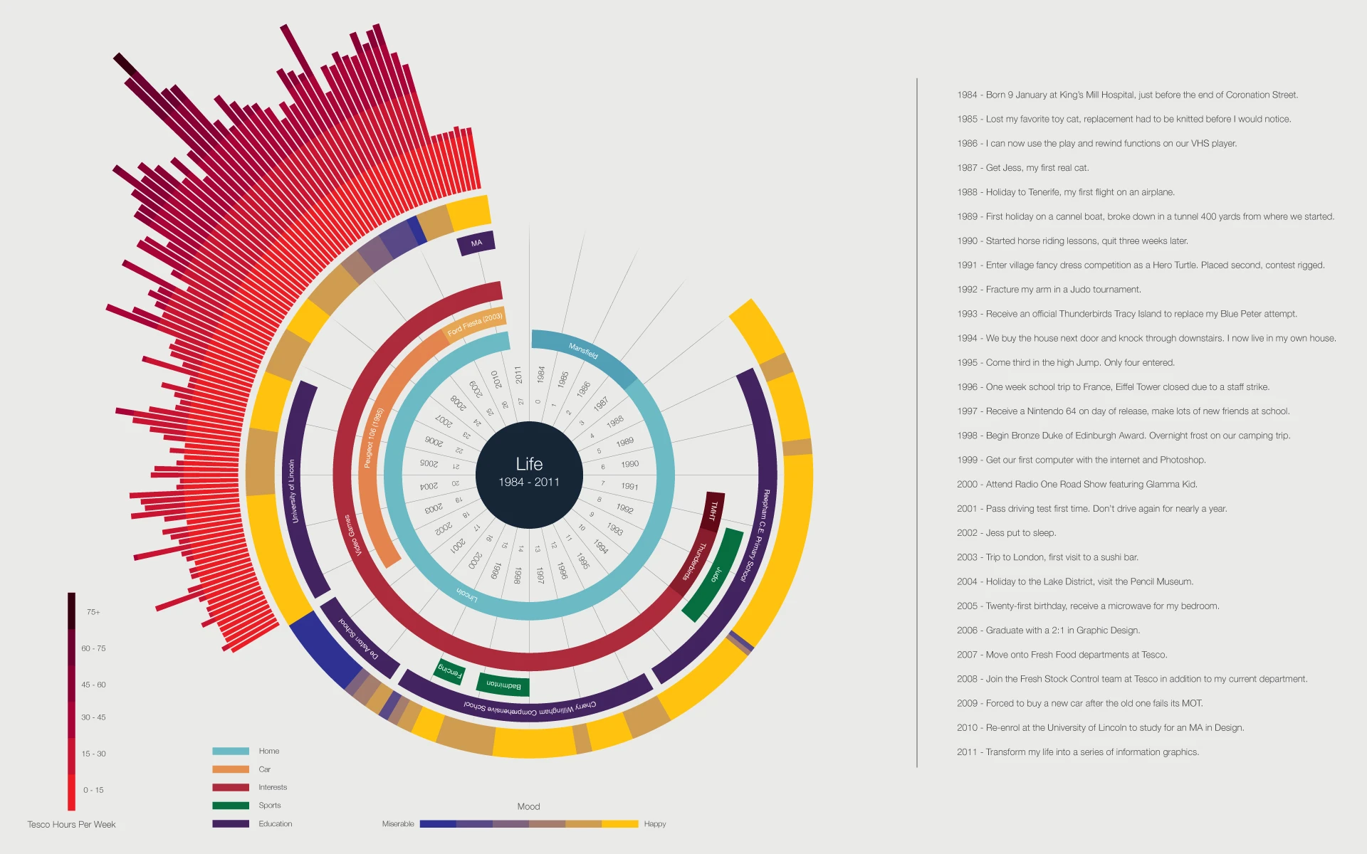
For the majority of my charts I have attempted to visualise precise quantitive data that can be accurately measured, however I also wanted to explore how more subjective information can be represented. This graphic is a visualisation of my life to date and shows a range of activities and allows comparisons to made to my general mood at this time. Most of the information presented here still needs to be represented accurately so I have used line lengths to communicate this clearly. Happiness of course is something that can't be measures accurately so I have selected a method that shows this which is more subjective way. I have chosen the colours that I feel are most appropriate, yellow for happy and blue for miserable. Each red bar represents four weeks at Tesco, the length relates to the mean average number of hours worked per week in that period. Light work is shown as a light shade and more work as a darker one. The viewer is able to see how these activities relate to each other, for example after initially finishing University I worked more at Tesco, became depressed and returned to study for an MA.